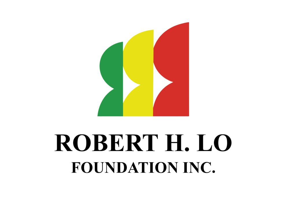
The logo of the Robert H. Lo Foundation, Inc. is a modern and symbolic representation of the foundation’s deep commitment to empowering Filipino communities through entrepreneurship, education, and social development.
It features three upright, stylized human figures in the colors green, yellow, and red, standing side by side in unity and progression. These figures symbolize the Foundation’s core pillars:
- Green represents agriculture, sustainability, and growth—echoing the Foundation’s support for Filipino entrepreneurs in the agri-food sector and its dedication to livelihood incubation and food security.
- Yellow stands for education, enlightenment, and opportunity, reflecting the Foundation’s scholarship programs for underprivileged but deserving Filipino students across various educational institutions in the country.
- Red signifies energy, compassion, and civic duty—embodying its work in youth and sports development, as well as support for broader charitable causes and corporate social responsibility.
The interlocking, upward-facing forms represent people uplifted by a shared purpose, emphasizing inclusive progress, capacity building, and hope. The overall design conveys a strong message: when individuals are supported through the right opportunities—whether in business, learning, or community—they rise together.
The clean, serif typeface beneath the icon reflects the Foundation’s professionalism, stability, and long-term commitment to public service.
In its entirety, the logo serves as a visual embodiment of the Robert H. Lo Foundation’s mission:
To build futures by nurturing potential, empowering enterprise, and championing inclusive development in every Filipino community.

